Lightroom Music Photos

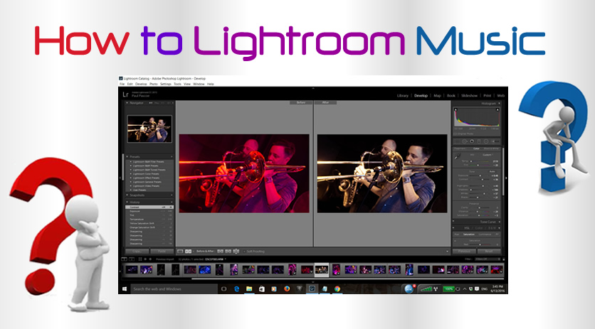
In this lesson we look at how to use Lightroom to process low light music photos which have bad lighting.

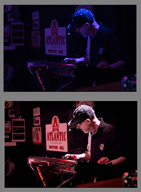
The power of Lightroom processing can be seen in the following “Before” and “After” Images:
How to Lightroom Music Photos 01
(Click the image to see full size in a new tab)

Lightroom can be used on “JPG” images, but works a lot better when used on “Raw” format images straight from the camera.

Most modern DSLR cameras have a setting in their Menu System where you can set the camera to shoot both Raw and JPG.

Raw Images are often four or five times larger than JPGs so make sure you have a 16Gig or even a 32Gig fast SD memory card installed into your camera.


If you have not ever used Adobe Lightroom, then we recommend checking out our Introductory Lightroom lesson on Sunsets at the link below:

Introduction to Using Adobe Lightroom

This Sunsets lesson takes you through all of the main Lightroom Panels and shows you the typical general processing flow.


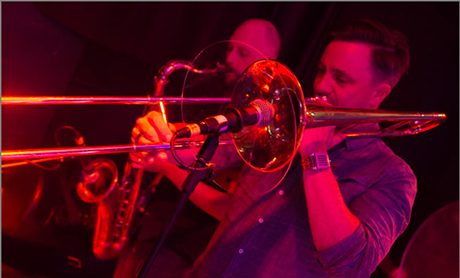
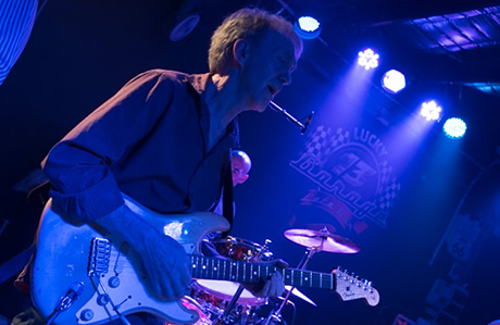
Often photos of musicians performing will be full of red, green, or blue light and as a result look either “Radiation Red”, “Shrek Green”, or “Avatar Blue” and will basically be unusable.

How to Lightroom Music Photos 02

But if we have shot our pictures in “Raw + JPG” mode, then we can take the “Raw” format file into Adobe Lightroom and colour correct the image into a quite reasonable photo:
How to Lightroom Music Photos 03           (Click the image to see full size)


Not all photos can be fixed as well as this one, Lightroom gives the best results when the entire photo is colour cast with a single primary colour, and the photo is sharply in focus.

Here is an original “Blue” photo BEFORE being recoloured using Adobe Lightroom:

How to Lightroom Music Photos 04

And here is the same photo after adjustments in Adobe Lightroom:
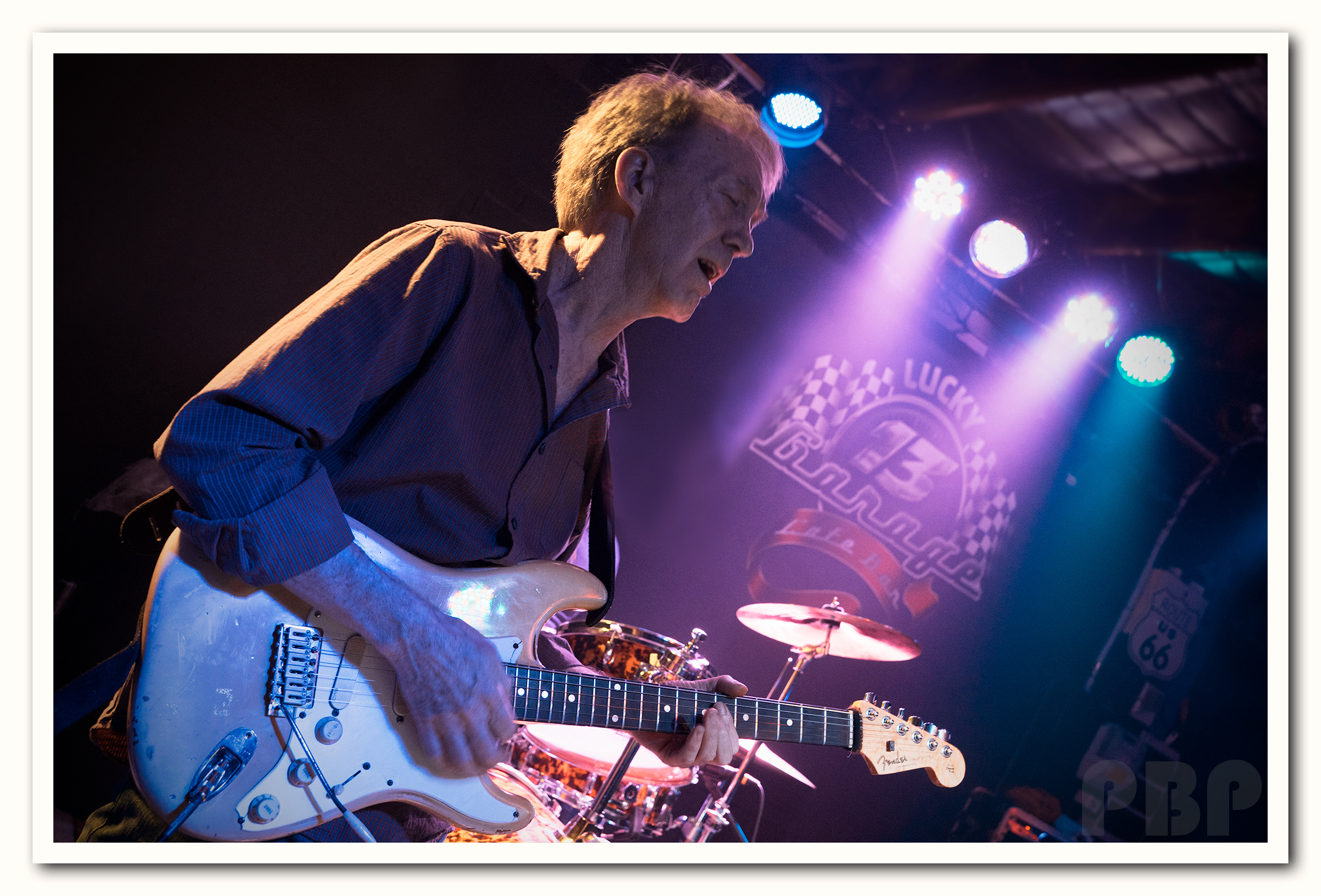
How to Lightroom Music Photos 05         (Click the image to see it full size)

The key to processing for the above two photos was to start the Lightroom workflow by going to the very bottom of Lightroom “Develop” Menu, to “Camera Calibration” and then use the RGB sliders to remove the dominant colour cast in such a way that the person’s skin becomes a natural looking colour.

From there we do all of the usual Lightroom adjustments such as Exposure, White Balance, and so on.

The following video explains in detail how this is done:

The main drawback to using Lightroom and Raw Files is the time it takes to get a photo looking good, compared to just taking a JPG file and doing some basic Photoshop adjustments.

At PBP we tend to only use Lightroom on photos that have good potential, but have been either heavily colour cast with one colour, or are extremely dull and need brightening up.

If we were preparing 30 or 40 photos for a Client, it would be madness to process all of them in Lightroom, because at up to 10 or 15 minutes per photo, it would be hours and hours of work.

Instead we would use the JPGs from the camera which are much quicker to process using Photoshop.

Where Lightroom is fantastic is when you have a great photo that is colour cast, or shots of band members in near darkness, and you really want to have that photo in the album. This is where you have a good chance of using Lightroom “to save the day” and recover that poor image into a great usable image.


Detailed Video About Lightroom

The following twenty minute video about using Lightroom for Music Photos shows some great techniques for image improvement.

It is a long but excellent video to watch to gain a lot of insight into using Lightroom for Music Photos.

The 20 minute video looks at fixing an unpleasantly coloured Guitarist Photo, and as we have stated, it is a long video but shows lots of useful things that music photographers can do to images taken in bad coloured lighting.

What is particularly interesting is the “Split Toning” which is done around the 7 minute point of the Video onwards.

With “Split Toning” we can set all of the bright highlights to one colour, such as yellow, and then set all of the shadows to a blue colour, and then colour mix them.
It worked nicely on the image he was adjusting.

We have used “Split Toning” in the following Before and After Images:

How to Lightroom Music Photos 06


Continuing with items of interest in the 20 minute video……..

Around the 9:20 mark, he shows how pressing the J key sets a mode where you can see where you are going to “Clip” on adjustments and lose detail.

We can then see where the photo is going to blow out and lose detail when we increase the Exposure slider.

Leaving the J key pressed and released, we can adjust “Highlights” and “Shadows” adjustments and see marked on the image where we are going to burn out and lose some detail from the image, but if it is background blacks or black hair where this is happening it is not a worry.

He then presses the J key again to turn this mode off, and we see the image again as normal, without any clipping highlighting on it.

In addition when choosing between adjusting vibrance and saturation, using vibrance is better because it does not affect the skin tones very much.

Remember that Saturation increases the intensity of ALL colours (including skin), but Vibrance only works on increasing colours that are dull and not yet saturated.

At the 12:40 point in the video it goes through how to use the RGB “Tone Curve” where you can adjust the colours in shadows and highlights, it does nice things to the background if you set it on medium contrast and work from there.

Around the 15:00 point he shows “Sharpening” and shows how to hold down the Alt key and mover the Masking slider so that only the person appears in the white outlines, and so only the person will be sharpened.
It works really well to set the “Masking” slider first with Alt held down, to basically select what you are going to sharpen, before you sharpen it.
Otherwise you will sharpen the background and sharpen ALL the noise that is in the image.
This is a great technique, because it avoids sharpening the lights and any noise grain that is in the background of the image.

At the 17:25 point he shows how to do Selective Coloring, which looks great if you have for example a red guitar that had some red light on it.
Basically you go onto Brush, do new brush, and choose “Saturation” from the drop down list for the type of brush.
You then drop the saturation all the way down, wind the mouse (or use left and right square bracket keys) to make the brush really big, and paint over everything except the guitar, and everything will then desaturate and the guitar stay red.
But he did all of this selective colouring at the end, AFTER he had got the photo looking really good as a colour photo.

At the end, he clicked in the left hand column the plus sign on this menu called “Snapshot” and it saved all of his LR adjustments.
He had another snapshot of when he had edited it previously, and could then flick between the two saved snapshots to see how the two edits were different.

A Snapshot is a record of an image’s editing at a certain point in its processing.

Click on the “+” sign in the Snapshots Panel to create a Snapshot. After you click on the “+” sign, the New Snapshot Dialogue Box will appear. Here, name this version of the image.
We can take multiple Snapshots of the image at various points in our adjustments editing, and these edit setting versions of the image will appear in a dropdown list in the Snapshots Panel.

When we export this one image that has multiple snapshots, the only image that will be exported is whichever Snapshot was applied last. This is because the Snapshots Panel allows you to create different versions of the image, but only one of the Snapshots will be active and exported at a time.

There is a lesson about “Snapshots” and “Virtual Copies” at the link below:

Lightroom Snapshots and Virtual Copies Lesson

He also does some Spot Healing to remove small glowing amp ligt type spots, but it is not clear in the video which icon he clicked to do this, but it was actually right next to the Crop tool.
We do spot healing or clone duplication in Lightroom using the tool next to Crop in the basic menu.

The following YouTube video demonstrates Spot Healing very quickly and clearly:

YouTube Video on Lightroom Spot Healing

The long 20 minute video is by far the best Music Photos Lightroom Tutorial we have managed to find on the web thus far.

However we did find some other useful videos and these are compiled and described in the following section.


Lightroom Video Tutorials

This first video is very interesting because the starting photo is a typical small low light venue photo with an ugly white tiles ceiling.

However the ceiling background is replaced with darkness, and a light is made to shine in from the side instead.

This video shows how to use Lightroom in conjunction with Photoshop to do this.

The “burning” of the white celing into darkness is done in Photoshop, as well as the fake lighting, but the rest is done in Lightroom.

He starts doing the fake lighting using Photoshop around the 11 minute 35 seconds point of the video.


The following video is the “Removing Radiation Red” tutorial that we referred to at the start of this lesson.

In this video, horrible Red Light is removed using mainly the “Camera Calibration” function in Lightroom 3 (which still works the same way in Lightroom 5 and Lightroom CC).

It is a nice short four minute video, and the colour correction which occurs is amazing.

This technique also works well on “Shrek Green” and “Avatar Blue” images as well.

But we need to have a dominance of one colour, and a sharply focussed raw image without any bright exposure blowouts to get good results.


In this next video, it is Lightroom 5 but looks the same as Lightroom CC, and the guy processes an over exposed ISO 6400 photo of a guitarist on stage in bright white light.

Interestingly, one of the first things he does is correct for the high ISO noise, by going to the right hand side Detail panel and sharpening and Luminance noise reducing the photo.

I thought you usually do these things last in the work flow, but he does them first, which is interesting.

His finished picture is better than the starting one, but he has not done anywhere near the level of refinements we have seen in other videos.


In this next video there is a concert photo that is quite good quality already, but just a few tweaks in lightroom really make the image “pop” with warm colour and vibrance.

The actual photo editing in Lightroom starts around the 1:27 mark.


This next video uses Lightroom and then “ON1 Photo 10” which is a Plug In for Lightroom and Photoshop that costs about $110 and can be purchased here:

ON1 Photo 10 Website

Here at PBP we have not ever used it, but it looks like an enhanced Lightroom, where various additional adjustable Filters like “Sunshine” are available.

From ON1 Photo 10, we can output our files as a PSD and take them into Photoshop.

The original starting Photo is quite good to begin with, so the point of the video is to make some refinements.


Lightroom Black and Whites

Sometimes we may have a red photo that we think we can adjust into natural skin tones colour, but things just do not work out.

This was the case with the following Red JPG image, and so we used Lightroom to create a great Sepia old style brown image.
How to Lightroom Music Photos 07 (Click Image to see it Full Size )


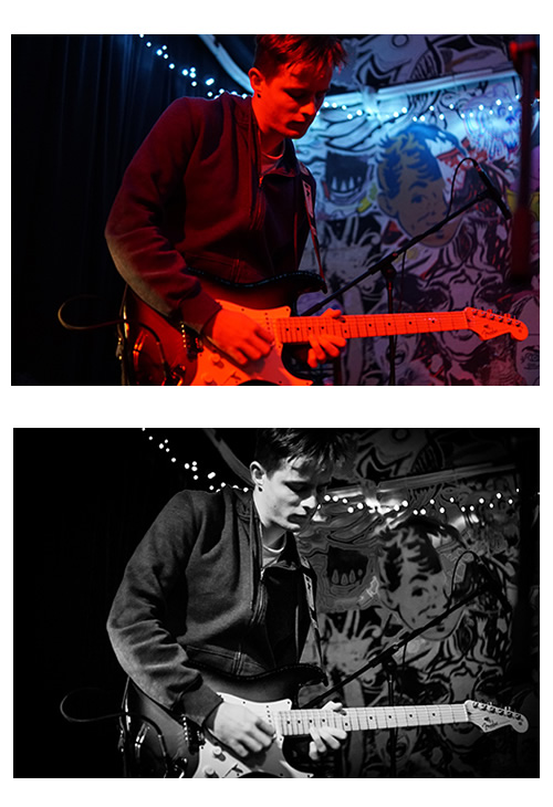
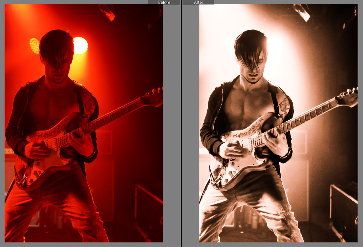
We might have another very red photo, that we decide to make high contrast black and white, rather than colour.

Here is a RAW image that we captured. immediately followed by the high contrast Black and White that we made in Lightroom:

How to Lightroom Music Photos 08

The following video shows how to make a high contrast black and white photo very quickly, from a very average colour photo with a lot of smoke machine haze in it at the beginning.

To find out more about making Black and White images using Lightroom, check out our previous lesson at the link below:

Lightroom Black and White Photos Lesson


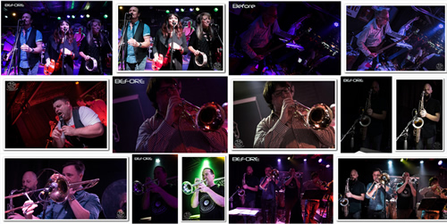
Gallery of Before and Afters

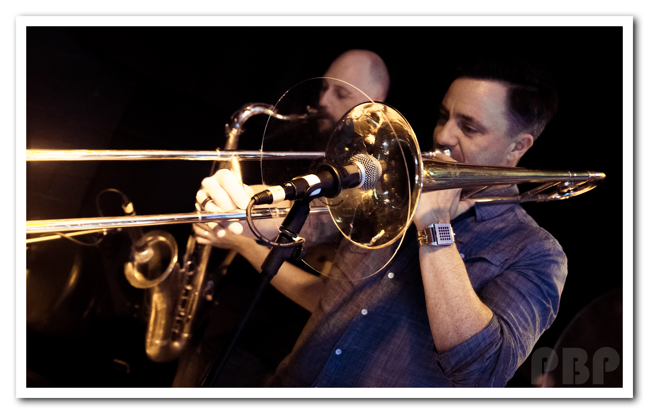
The following Flickr Gallery contains a set of Before and After images where we have used Lightroom to repair a previously discarded image.

In most cases the inferior quality “Before” image is labelled, and then immediately followed by the repaired image which is not labeled, but is sitting in a White Drop Shadow Photo Frame.

Gallery of Lightroom Before and After Images


Video about Music Photos

This is a bit Off Topic, but while looking for Lightroom Videos, we found this interesting video about shooting a band, changing lenses and using fish eye lens to great effect:


We hope you have found this Adobe Lightroom lesson useful and it helps you save some great music shots from the discards folder.

Just remember to shoot in Raw + JPG mode, because Raw images always respond better to treatment in Adobe Lightroom.

Enjoy,
Passy
How to Frame Images

In this lesson we demonstrate in detail three different ways of adding frames and borders to your photos by using Adobe Photoshop.

Although we created this lesson using the Creative Cloud Photoshop CC, the steps should be exactly the same in Photoshop CS5 and CS6.

This lesson also lets you choose your prefered mode of learning, as we have both tutorial videos, and a PDF document of full written instructions.


Black Border Frames

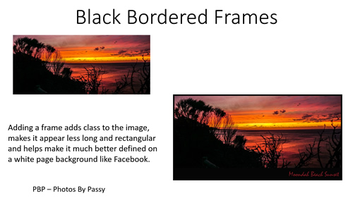
The first of our three lessons is about adding a black frame border, and this works great on Sunset and Forest Photos.

How to Photoshop Borders and Frames 01

The following Video Tutorial shows how to do this step by step in Photoshop.

Down at the bottom right hand corner of the player, we suggest you click on the “HD” icon and choose full 1080p HD resolution if you are going to watch the video in full screen mode.

There are also full written instructions available which can be accessed by clicking the link below:

Instructions for How To Make Frames and Borders


Border Frames with Drop Shadow

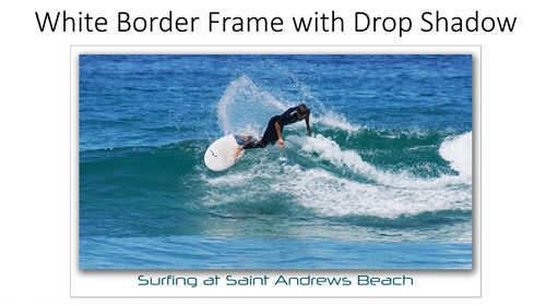
In this next tutorial we show how to make multiple frames and outlines around a photo, as well as how to add a Drop Shadow effect that makes the image appear elevated up onto the page.

This creates a great feature image for uploading to social media sites such as Facebook.

How to Photoshop Borders and Frames 02

The following Video Tutorial shows how to do this step by step in Photoshop.

Down at the bottom right hand corner of the player, we suggest you click on the “HD” icon and choose full 1080p HD resolution if you are going to watch the video in full screen mode.

There are also full written instructions available which can be accessed by clicking the link below:

Instructions for How To Make Frames and Borders


Double Frame Drop Shadow

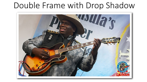
Melbourne Photographer “Ian Peter Smith” uses this type of frame a lot on the Photos he posts to Facebook and it is extremely effective.

It was from his images that we got the idea of creating one of these types of frames in Photoshop.

How to Photoshop Borders and Frames 03

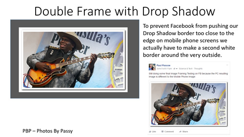
It is actually a double frame, as there is a White Frame around the outside to stop Facebook “edge cramming” it on Mobile screens.

How to Photoshop Borders and Frames 04

The following Video Tutorial shows how to do this step by step in Photoshop.

Down at the bottom right hand corner of the player, we suggest you click on the “HD” icon and choose full 1080p HD resolution if you are going to watch the video in full screen mode.

There are also full written instructions available which can be accessed by clicking the link below:

Instructions for How To Make Frames and Borders


We hope you find these Photo Framing techniques useful for making your feature images look their very best on Websites and Social Media.

Enjoy,
Passy

How To Mashup Video

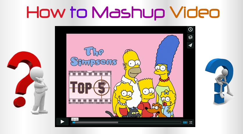
In this “How To” lesson we show you how to download MP4 footage as well as MP3 sound files off YouTube, and then using Adobe Premiere cut out pieces of these downloads and make your own customised clip; which in the trade is often called doing a “Mashup”.

This is an activity I give to my students as their first step towards learning how to use Adobe Premiere CC.

Even if you do not use Adobe Premiere as your video editor, the concepts and techniques covered in this “How To” lesson should easily be transferable to “Windows Movie Maker”, “Filmora”, “Camtasia”, and most other movie making software.

If you cannot afford an Adobe Creative Cloud Subscription for Premiere, and want to look at using some “Free” Movie Making Software, then check out this article from Tech Radar:

Free Movie Making Software List and Review


Here is an example of a completed one and a half minute Mashup Video, called “The Simpson’s Top 5”:

Because I am a school teacher, and this video is for educational purposes, there is no Copyright Infringement involved here.

However, if you try to load your own MashUp to YouTube they will probably immediately red flag it as a copyright violation.
So by all means learn some Premiere using our tutorial about making a YouTube Mash Up, but do not load it up to the web anywhere.

The following PDF document takes you through step by step “How to Make a Mashup Compilation Video using Adobe Premiere Pro CS6”.

Read the PDF of Instructions for Making a Mashup Video


How To Do Mashup Videos

We have also made a 20 minute “How To” video about using Adobe Premiere CC to make a Mashup Video.

(This is the first time PBP has used Camtasia to make a How To Video, and we plan to do more of this in the future).

If you have trouble with the instructions in the PDF, or would prefer to learn by watching a video, then use the “How To” video below.

We recommend watching the video on a 1920×1080 computer screen, and clicking on the “HD” on the player bar to set the video to 1080p, and then click on the 4 way arrows icon next to HD, to watch the video full screen. If you are using a Tablet, then perhaps choose the 720P setting in the pop up “HD” menu.
Press the Esc key at any time to exit from full screen view.


Our Mashup Tutorial is a great fun way to start learning how to use Adobe Premiere CC for making videos, and you could use the skills shown here to make a video slideshow of some photos, or your own Highlights Video which includes Title and Commentary slides that you have made using Photoshop, PowerPoint, or other software.

It also should give you the technical skills to edit up a video recorded Interview and/or live footage into a Project Video that could be used for Business Marketing or a School or College Video Assignment.

Like Share and Enjoy,

Passy

How to Lightroom Sunsets

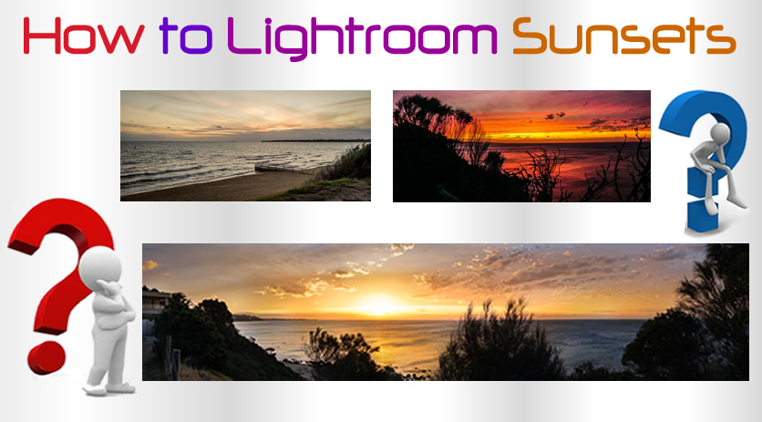
In this lesson we look at how to use Adobe Lightroom CC to improve Sunset Photos.

Getting great sunset images is a combination of manually setting your camera exposure for the sky (and then holding down the AEL Auto Exposure Lock button on the camera while framing and taking the shot, especially on Panoramic shots). Well this is what applies when using a Sony DSLR, which has a brilliant in camera Panoramic function setting, as well as an AEL button.

The next step is to take your photos into Adobe Lightroom (even if they are JPG images), and do the adjustments and touch ups outlined in this “How To” lesson.


Camera Settings for Sunsets

We do not discuss in detail Camera settings for Sunsets in this lesson, as the main focus is on using Adobe Lightroom.

But the number one rule is that the camera dial “Sunset Mode” needs to be avoided, and shooting done in full Manual Mode.

Recommended Manual Mode Settings:

– Exposure Mode: Manual
– Focus Mode: Manual
– Shutter speed: 1/30th sec or longer.
– Aperture: f/16
– ISO: 100 or lower
– Lens: wide at 18-24mm
– Drive Mode: Single-shot
– White Balance: Daylight

Perhaps use a Tripod with a remote control for shutter release if you can (but we have not done this with our photos).

If you need to know more about how to set your camera for Sunset Photos, then read these articles:

12 Tips for Sunset Photography

30 Tips for Sunset Photography


Lightroom and Sunsets

We could probably get even better results by shooting in Raw format and using Lightroom, however most of the photos we have processed in Lightroom in this lesson have been JPG images.

We have been using the Creative Cloud Lightroom CC, but from what we have seen in YouTube videos it seems pretty much the same as Adobe Lightroom 5.

Here is one example of what can be done using Lightroom.

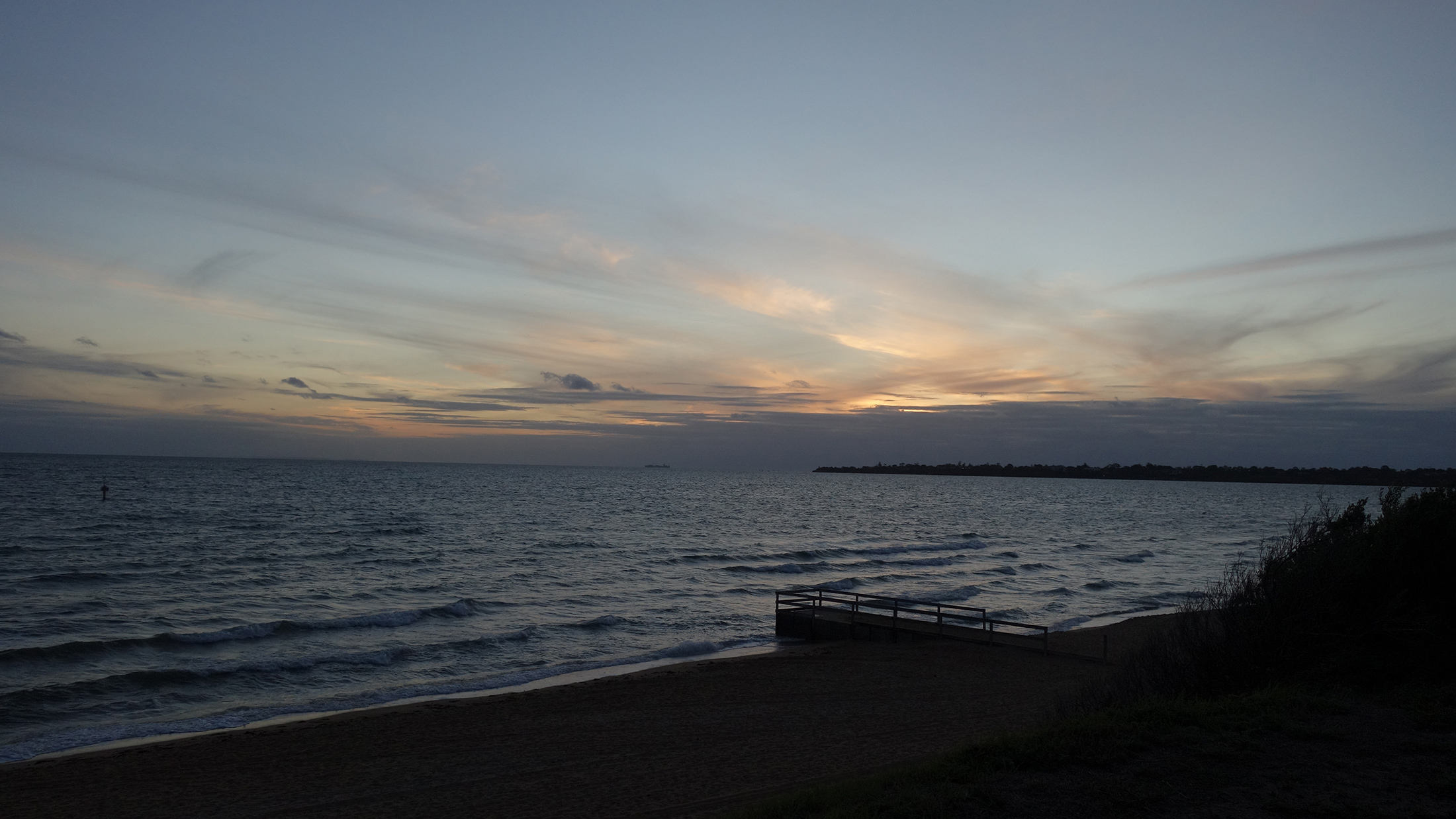
First of all is the Original Image (Click on it to view full size)

Lightroom Sunset Photos 01

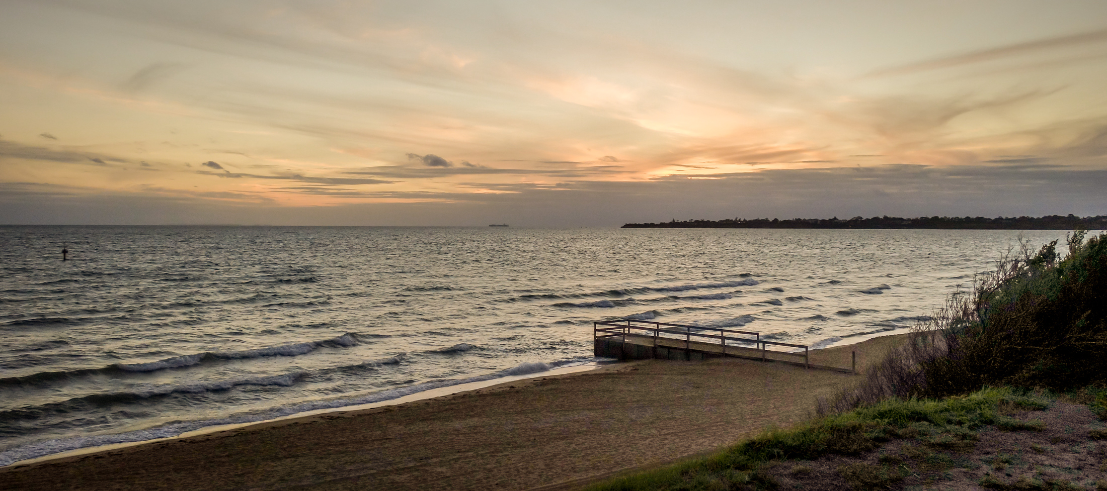
and here is the same Sunset Photo after applying Lightroom settings to it (Click Image to view full size)

Lightroom Sunset Photos 02

The above changes were made by following along with the following YouTube Video, which is a great Video for complete beginners to Lightroom.

(Later in this lesson, there is a second video which covers some more advanced techniques).

Keep in mind that the changes we make in Lightroom are always small and subtle, and simply restore back in some of the Sunset splendour that the camera has lost by exposing a bright sky and then making a very dark foreground.


Lightroom Video One

This video has over 300,000 views on YouTube and first thing this guy does is setup a folder on his external hard drive
for output pictures to go to. This is very handy if you are using Lightroom on a Laptop, and also on a second main PC.

Another thing he stresses is to shoot raw to capture more colours and dynamic range, which we have not tried out yet.

We have shot Jpegs and will see how Lightroom goes on them, but in future we should shoot in raw + jpeg mode, as we have the
option on the camera to do this, and easily enough room on the SD card.

Basically we watched this video, pausing and following along and trying out the things he does in Lightroom.

This is how we made the before and after image effects shown previously.

Here is a summary of what Lightroom functions are carried out in the Video.


Importing Pictures

For the Importing process, LR at first could not find individual folders on the C drive, so it seemed you have to do something like copy your pictures into “My Pictures” Windows folder, but then we clicked somewhere near our C drive in the left hand panel and it did find all our own custom made Windows folders. A bit strange, but at least it works.

On the Import options, we chose “Add” to add photos to catalog without moving them.

We then change at the top from the Library Module to the Develop Module on the top of screen menu items.


Cropping Photos

In Develop Mode, the Crop Tool is the first tool. It has a great feature for straightening the horizon: just go to the corner of the photo
until the rotator arrow appears, then push down the mouse and rotate. A detailed grid temporarily appears while you do this.

There is also a Spirit Level that can be used in the Crop Tool options, but we had no luck with this level method.


Basic Adjustments

When we open this panel in the right hand column, the first thing to adjust is the white balance.

There is an eye dropper to dip into something in your photo that is white. On our sunset photo, the colour was too blue (cold) overall, and we had nothing white to dip into. So we moved the slider to the right, to warm up the photo, and remove the blue cast.

The next thing is to go to the adjustment sliders. First try clicking “Auto” like in the video, but this did not work well at all on Sunsets, and so we used Ctrl-Z to undo. If you use the bottom right hand corner “Reset” button like in his video, it will undo everything and take your picture right back to the start. If this happens, just go to the very top left hand buttons, and do Edit > Undo Reset.

Note in the video, around the twelve minute mark, he also shows the left hand side “History” panel, where you can click on each history item, and see what the image looked like at that stage of your editing.

In Basic adjustments, when you have exposed for the sky, (like in a sunset shot), we take the highlights all the way to the left, and the
shadows most of the way to the right. This seems to turn the sunset photo into daylight, which is kind of weird.

Too much of shadows set too far to the right seemed to introduce a lot of noise grain into our photos.
Perhaps we need to originally shoot them at ISO 100 or 200 with a longer exposure and use a tripod, to have clearer starting shots.

Next, we put the Clarity up which adjusts midtones, and adds a sharpness type effect to the image.

The video suggests not taking Clarity up past the 40% level as a maximum, and this seems to be a good idea.

Clarity does introduce some noise grain onto the image, and apparently also distorts peoples skin tone colours.
(Noise is adjusted later on, when we do the “Detail” panel settings).

Next we adjust Whites and Blacks.

We can hold down Shift where it says “Whites” and double click to get an automatic adjustment done by lightroom.
We can do the same with Blacks. To undo and set the sliders back to the middle, we hold down no keys, and just double click on “Whites”.
We do the same and double click on “Blacks” to reset them.

I guess using the standard Ctrl-Z undo process would do the same thing.

We found that the Shift Double Click let Lightroom do the settings method did not work well on Sunsets, and the Hold down Alt key method described below did a much better job.

The other method is to hold down Alt, and the whites screen goes black, then we add whites until only the first set of highlights show through.

We can also use Alt to adjust the blacks, and go a little stronger to the left on these.

The last two Basic settings are Vibrance and Saturation.

Vibrance adjusts every colour that is not already saturated, while Saturation will adjust every colour, even if it already saturated.
Vibrance is more subtle than Saturation, and so we often add a little Vibrance, but do not add any saturation.

Once all the Basic Adjustments are done, you can press the “Y” key to see the Before and After side by side, and press Y again to turn it off.

The back slash \ key performs a similar before and after function, (on most but not all keyboards).


HSL Adjustments

With the HSL panel, we can intensify the saturation of certain colours; specifically we can adjust Hue, Saturation, and Luminance (HSL).

First we do Saturation and then we do Liminance to adjust the brightness and contrast of the colour.


Detail Adjustments

The next panel we use it the Detail Panel for doing Sharpening and Noise Reduction.

It is suggested in the video to simply do Sharpening to 70, and Noise Reduction to 40.


Effects Adjustments

Using this panel we can create vignettes. A slight black vignette can draw attention to the middle of the photo.

A Black vignette (slider to the left -10 to -20) seems to work well on a Sunset Photo.


Exporting the Image

If your image is a raw image (or a Jpeg) we need to export it to put it onto FB or Instagram.

We do File > Export and then have an extensive panel to do settings on.

To find out what to do, watch the 23 minute mark of the video, Export to a specific folder, and do not add to the catalog.

Note that you can export to a PSD Photoshop file and then take it into Photoshop later on, but we are doing a JPG, SJPG, Quality 100,
and do not limit the size.

Resolution is 72 for FB and online, and 300 for Printing.

When you export, a status bar goes on the top left hand corner until it is finished.

The resize option is strange, because if you use Width and Height, it does not adjust height automatically when you change the width.
So we used the “Long Edge” option, and then set it to 2048, or 2200 to 2800 for Panoramic images, to make a suitably sized JPG for Facebook.

Another slightly annoying feature, it that unlike Photoshop, it does not show you the estimated size in Megapixels for the final image when you resize or change the quality.

When we used full quality and around 2048 to 2800 wide, we ended up with a 1.45 MB image which is quite large to load up to the Web.

When we exported to 85 percent quality the file size went down to only 1.11 MB with no difference in quality visible.

However we did find on other photos we resized using the “Long Edge” option, that the file size came down to between 700K and 1.4MB which was fine for uploading online to Flickr and Facebook.


Using Lightroom for Sunsets

We found another great video for beginners about doing Sunset Photos in Lightroom.

This Video includes using FILTERS and the PAINT BRUSH, as well as the SPOT HEALING TOOL for removing any spots caused by dust on your lens.

The YouTube video shows how to use filters to mask off areas like the sky and work on them, as well as using colored gradient type paint brushing. Although he does it a little bit quickly, it is easy enough to follow along with and figure out the techniques.

He also shows some other great tricks for getting a really good sunset photo out of a very drab grey sky photo to start off with.

On the video the guy goes on and on a bit about a few other things at the start, and does not really start on the lightroom processing until the 5 minute mark or so.

Here is a Before and After Panoramic Photo we made by appying the effects shown in the video, (particularly the Paint Brush).

Click each Photo to View it Full Size.

Lightroom Sunset Photos 03


Lightroom Sunset Photos 04

The effect I was going after was to make the sun look like a nuclear bomb explosion, as its energy does come from Nuclear reactions on its surface. It is perhaps not to everyone’s liking, but I like it, and it was exactly the look that I wanted.

Lightroom allows for all types of artistic creativity with its range of awesome tools!


Using the Brush Tool on Sunset Areas

When you use the brush tool, always have feather at 100, then adjust the Density and Flow starting at 50 each with a big brush, and some red or yellow colours.

Then click New for a new brush, and make it smaller, and set Flow and Density to 80 and go over the area where the sun is again.

Then click New, double click each of the sliders to set them back to zero, then up the exposure to the right and brush with that to lighten up areas like whites on wave caps, green bushes and trees, etc.

The whole time you do this, little white round movable adjustment dots start appearing, and the “H” key is a toggle to make these dots visible and not visible.

See the previous YouTube video around the 10 to 12 mins part to see the Paint Brush in action.


Using Lightroom Filters

Filters can be tricky to manipulate when using Lightroom for the first time as a complete beginner.

It is not immediately obvious how to move the three lines and the dot on the graduated (gradient) filter, or how to adjust them.

The thing to remember is that the Filter is making a dark to light see through gradient on your image, and the set of three lines are the graduated (or fade in and fade out) edges of the dark to light change. (Light to Dark happens when you move the Exposure slider).

The filter does not have to be a dark to light change, as there are sliders to make all sorts of Gradients in the Lightroom Options. For example a Filter on the sky portion can make a Saturation change to make the faint and whispy top parts of sunset clouds far more intensely coloured.

The other great thing is that once the filter is placed onto the image, the sliders can be adjusted to create all sorts of graduated effects, including sharpness and blurring using clarity.

The following Video gives a great demonstration of how to use the Rectangular shaped Graduated Filter:

We have not used the Radial Filter on sunsets at all, but probably could do so around the sun perhaps, and here is a video about how it works:

And finally another interesting video about using Radial and Graduated Filters:


The H and Y Keys

The letter H is the Hide and Unhide key in Lightroom.

Pressing the letter H on the keyboard toggles between hiding Paint Brush or Filter settings on the image and unhiding them.

However we found that if you hide settings on a filter, then the next time you set another filter, you cannot see any settings to adjust this latest filter. It seems that the H key hide stays turned on forever, until you hit “H” again.

so when working with Filters or paint brush, you may need to press the H key to make the settings appear.

This is kind of annoying, because any new filter should really have the settings lines shown immediately so they can be adjusted.

Other useful keys are the “Y” key to show before and after images, (Y to see them, Y again not to see them), as well as the backslash key \ which does a similar before and after view of the image.


Lightroom Sunsets Summary

The basic workflow when doing a Sunset Photo in Lightroom is as follows:

1) White Balance – just usually give it a slight Temperature Change to the right, from blueish cold to a bit warmer.

2) Highlights all the way to the left, and Shadows most of the way to the right

3) Clarity up to around 40% as a maximum, which adjusts midtones, and adds a sharpness type effect to the image

4) Whites and Blacks – Hold down Alt, and the whites screen goes black, then we add whites until only the first set of highlights show through.

Also hold down Alt to adjust the blacks on its all white screen, and go a little stronger to the left on these.

5) Saturation and Vibrance – Saturation does all the colours, Vibrance only adjusts the colours that are not already saturated.

6) The HSL Adjustments

With the HSL panel, we can intensify the saturation of certain colours.

We can do Hue, Saturation, and Luminance.
First we do Saturation and then we do Luminance to adjust the brightness and contrast of particular colours.

These need to be subtle for each colour, try to only go within plus or minus 20% on the sliders.

Some colours do not require any adjustment, usually we are doing Red, Orange, Yellow, Blue and Green.

7) Detail Panel for doing Sharpening and Noise Reduction.

Whatever we do the Noise reduction for, do 100-this for the Sharpness.
Eg. NR = 20 then Sharpening = 80.

8) Paintbrush Tool – make sure feathering is 100 and add yellows and reds as well as exposure changes. Do New button for new brush each time.

9) Filters – the vertical rectangle symbol between crop and paintbrush on the top row of the right hand column.
We can move the filter up and down, change its width, and tilt it using the middle line in it.

Filters are great for laying diagonally across the Sunset and brightening it up.

10) Effects Adjustments – A Black vignette (slider to the left -10 to -20) seems to work well on a Sunset Photo.

There you have it, the ten steps for processing a sunset image in Lightroom.


That’s it for now, we will add some more to this lesson, as we work more with Sunset Photos in Adobe Lightroom.

A Flickr Gallery of our Sunset Photos can be viewed by clicking the following link:

Note that only the first nine or so images (at the time of writing) have been adjusted in Lightroom.

The other images are all either straight out of the camera, or adjusted in Photoshop which does not work nearly as well as Lightroom.

Flickr Gallery of Sunset Photos

Enjoy,
Passy

Video Intros Outros

Videos look a lot more professional with a short Introduction segment and a set of Rolling Credits at the end.

In this article we show how we do Introductions and Rolling Credits for our Music Videos.

All of our work is done using the Adobe Creative Cloud, and so we will be talking about using Adobe Premiere Pro, After Effects, Photoshop, and Fireworks.


Video Introductions

Some video makers really “go to town” with over the top animated 3D looking introductions made using Adobe After Effects.

Certainly if you take the time and effort to make a fantastic introduction to your video production company, then it is the gift that keeps giving, and you can use it over and over again on every video you produce.

If you want to do this sort of thing, then see the links in the “Further Reading” section at the end of this article.

For our live music videos we are determined to make it all about the Client, rather than us, and so we focus the brief introduction based entirely on them.

We also like to keep it simple, and so we use either a still slide we have made in Photoshop or Fireworks, or a simple animated graphic or text of the Band’s Name and/or Members.

If the Band already has a great logo on their FB Page or Website, then as shown above, as simple intro can be made over the top of the intro bars of the first song, and then this can fade out to reveal the musicians.

We do this by making a new 1920 x 1080 black background slide in Adobe Fireworks, importing the Band Logo image (captured off their site using the Snipping Tool if we cannot save the image).

We then flatten the layers and save it as a high quality JPG file about 150k to 250k in size.

It then goes into Adobe Premiere as a layer above the video, with a fade out reveal type effect on it.


The second type of Introduction we do is basically the same as the Band Logo one above, but instead we make a 1920 x 1080 sized Band Poster to use. (Play the first few seconds of the video below to see this in action).

In the opening slide for the above video, we took a band photo and made our own text (using dafont.com to get the right style) and also made the 3D winding grid pattern in the background.

This was all done using Adobe Fireworks, but could have also been done in Photoshop.


The third and final type of Introduction we like to do is a simple rapid grow text type introduction, as in the following video.

This type of animated intro can be easily made entirely in Adobe Premiere Pro, and does not require the use of Adobe After Effects at all.

We worked out how to do this frame by frame type resize tool on a basic graphic we made first in Fireworks by watching the following “How To” video.

This video explains how to put in key frames and animate intro text:

We first made a cropped image of the Size Matters Logo in Fireworks, and saved it into our video project folder.

Then we put it into media browser preview and moved it down onto the timeline as the top layer.

Then we clicked the top of screen “Effects” in the left media preview browser and changed its size from small, and using keyframes made it bigger and bigger by dragging its corners each keyframe.

In the How To video he says to click the clock to make a new keyframe, but in Adobe Premiere Pro CC we had to instead click the diamond keyframe symbol each time to make a new keyframe.

It was very easy after watching this video, and you can make a back background image in Fireworks or Photoshop like we did as our starting point , rather than enter text with Adobe Premiere Pro.


Basic Video Outro

BasicOutro2

If the video is a basic production that does not require a minute of rolling credits at the end, then we tend to simply use a closing slide like the one shown above.


Rolling Credits

Making a Rolling Credits Ending or “Outro” for a Video is a bit more work than making an Introduction and involves using Microsoft Word, Adobe Photoshop, Adobe After Effects, and creating a “Black Video” in Adobe Premiere.

The great thing is that once you have made your first one, you can easily do Save As on the Photoshop .PSD file and then edit it in Photoshop to make another one for another video.

We also find that it works well to use a suitable soundtrack from the live band to run behind the rolling credits, rather than have complete silence.

If you go to the 13:50 minute mark in the following video, you can see an example of our standard Rolling Credits:

After watching several YouTube “How To” videos about Rolling Credits, we found the following “Gem”, which we refer to everytime we make rolling credits:

One very important thing we found out (by trial and error) is that to get the smoothest rolling credits it is important to make the After Effects animation have a total duration that is a multiple of the frame rate of your video.

Eg. If your video is running at 25fps, then the Credits duration needs to be 25, 50, 75, or 100 seconds to get the smoothest animation in the final rendered video.


Further Reading

There are plenty of YouTube videos about how to make spectacular Adobe After Effects animated Introductions.

The following is an AE Tutorial on how to make Cinematic opening screen with 3D letters:

The following website has a tutorial about using text in after effects, several videos plus free resourses:

Free After Effects Tutorials

The following video shows how to make a cinematic introduction with text and flare effects:

This next video shows how to make a Flame Text intro in After Effects:

This next video (with over 1 million views) shows how to make a spectacular video opening using Flare and Particle Tracking Plug Ins:

The following After Effects Tutorial shows how to make a very flarey cinematic film opening:

This is a brief selection of After Effects Tutorials, there are many more of these type of Tutorials to be found on YouTube.


We hope this article helps you make some wonderful videos.

Enjoy,

Paul at Photos By Passy


If you found this article useful, then make sure you give our
“PBP Photos By Passy” Facebook Page a Like.

Photos By Passy Facebook Page